
Bathroom Tile Ideas That Won’t Feel Dated in 5 Years
274 views
A bathroom can look expensive on installation day and strangely old-fashioned three years later. The culprit isn't always the vanity, faucet, or mirror. Quite often, it's the tile.
Tile covers a huge percentage of a bathroom's visual surface, so a fashionable color or pattern can become the room's defining timestamp. That doesn't mean you need to play it safe with plain white squares. Far from it. The better strategy is to choose materials with staying power, then use layout, texture, grout, and smaller accents to give the room personality.
That approach fits the direction Room Trends has been taking with its broader design coverage: warm neutrals, natural-looking materials, practical choices, and interiors that feel lived-in rather than staged.
And there's a useful distinction here: timeless doesn't mean trendless. A bathroom can look current in 2026 without being trapped in 2026.
Start With the Tile's “Five-Year Test”
Before falling for a showroom sample, imagine the same bathroom five years from now.
Would the tile still work if you replaced the vanity? Changed brushed brass hardware to chrome? Painted the walls a different color? Swapped a modern mirror for a traditional framed one?
If the answer is yes, you're probably looking at a strong long-term choice.
If the entire room depends on one very specific pattern, unusual color, or fashionable finish, the design has less flexibility.
This is why warm stone colors, restrained veining, classic proportions, and subtle texture tend to perform so well. Current 2026 design coverage is moving toward large-format stone looks, warmer neutrals, matte surfaces, artisanal textures, and carefully controlled pattern rather than one-size-fits-all minimalism.
1. Warm Stone-Look Porcelain Is a Strong Long-Term Bet
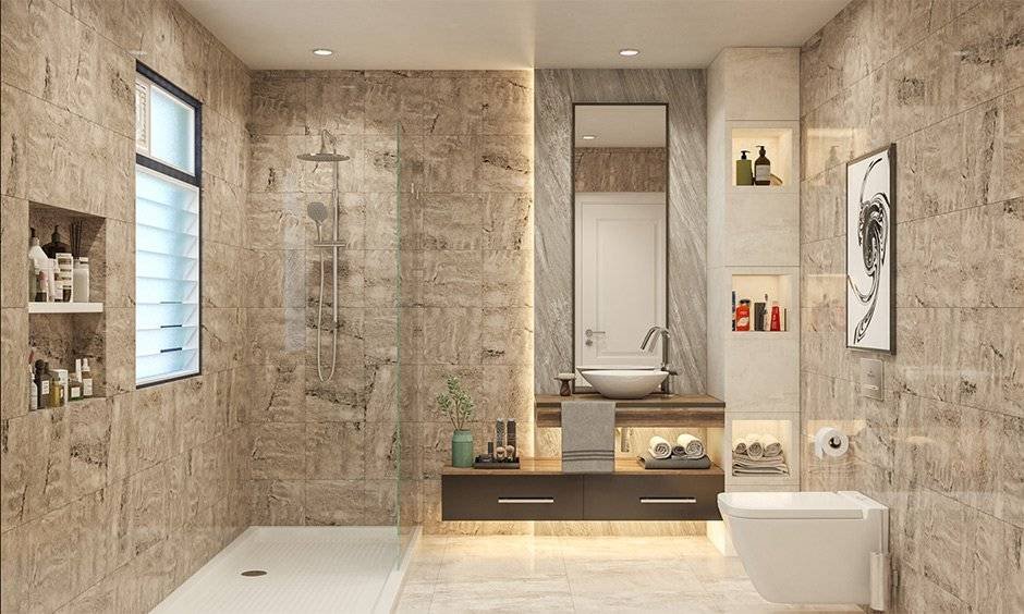
If I were trying to make one bathroom renovation decision with the next decade in mind, warm stone-look porcelain would be near the top of my list.
Think limestone, travertine, sandstone, or softly weathered concrete—not a perfectly repetitive printed pattern.
The appeal is partly aesthetic. Natural stone has been used in architecture for centuries, so stone-inspired surfaces don't carry the same obvious timestamp as many short-lived decorative trends.
Porcelain also gives homeowners a practical advantage. It is dense, durable, and available in large formats that can dramatically reduce the number of grout joints.
A 24-by-48-inch format, for example, creates a completely different visual rhythm from a 2-inch mosaic.
The trick is restraint.
Choose a stone look with variation, but avoid dramatic veining that dominates every wall. Subtle movement is much easier to live with.
2. Large-Format Tile Makes a Bathroom Feel Quieter
Large-format porcelain isn't merely a modern-looking choice. It changes how the room is visually read.
Fewer grout lines mean fewer interruptions. A small bathroom can therefore feel calmer and more continuous, particularly when the same tile flows from the floor into the shower area where the installation allows it.
Current bathroom design guidance continues to favor formats such as 60 × 120 cm and larger for precisely this reason.
There is a catch.
Large tile is less forgiving during installation. Walls and floors need to be appropriately flat, cuts need careful planning, and lippage—the visible difference in height between adjoining tile edges—can become painfully obvious.
Don't choose a large format simply because it looks impressive in a showroom.
Choose it and budget for the installation quality it requires.
3. Use Subway Tile as a Classic, Not a Default
Subway tile hasn't suddenly become bad design. The problem is using the same version, same glossy white finish, same running-bond layout, and same dark grout everywhere.
A classic material becomes tired when every design decision surrounding it is predictable.
Try warm white rather than stark refrigerator-white. Consider a handmade-look surface with slight variation. A vertical stack can make a low ceiling feel taller, while a traditional running bond works beautifully in a more classic home.
There's also something to be said for letting the architecture decide.
A 1920s home may look wonderful with a restrained traditional subway installation. A contemporary apartment might benefit from a stacked arrangement with matching grout.
The tile isn't the whole design. The installation is part of the tile.
4. Choose Grout Like It Will Be There Forever
Grout is easy to underestimate.
It shouldn't be.
A bright white tile with charcoal grout creates a strong graphic grid. That can be fantastic—but it's also visually committed. Matching or closely related grout, by comparison, softens the joints and lets the tile itself become the focus.
Warm whites, sand, mushroom, beige, and soft greige are particularly useful with today's warmer bathroom palettes.
There's a practical reason to think carefully about grout, too. Grout joints aren't waterproof; the waterproofing system and properly prepared substrate are what protect a shower assembly from moisture intrusion. The Tile Council of North America explicitly warns against treating grout joints as the waterproof barrier.
So don't spend hours choosing grout color while ignoring what is behind the tile.
The hidden work matters more.
5. Let Classic Pattern Do the Decorating
If you want pattern, you don't have to cover the bathroom in a loud geometric print.
Herringbone is a good example of a pattern with historical staying power. Checkerboard can also work beautifully, especially when the colors are softened rather than pushed into an extreme black-and-white contrast.
Basketweave is another option for traditional and transitional bathrooms.
The useful rule is simple:
Put the personality into the layout before putting it into an irreversible color.
A herringbone wall in a calm stone or marble-look tile can feel distinctive without screaming for attention. And if your taste changes later, towels, paint, lighting, and hardware can shift around it.
6. Bring Texture In—Carefully
Flat porcelain everywhere can sometimes make a bathroom feel overly manufactured.
Texture fixes that.
Fluted surfaces, softly rippled tiles, handmade-look ceramics, and subtle relief patterns can create changing shadows throughout the day. Current bathroom trends are increasingly emphasizing texture and artisanal surfaces, but the most durable applications are usually restrained rather than covering every surface in relief.
A textured vanity wall is enough.
A textured shower niche is enough.
You don't need three competing textures fighting for attention.
One tactile surface surrounded by quieter tile often looks considerably more sophisticated.
7. Use Bold Color Where It Can Be Changed
Deep green. Terracotta. Navy. Burgundy.
These colors can look incredible in bathrooms, and there's no reason to eliminate them simply because you're worried about trends.
The smarter move is placement.
Instead of committing to a saturated tile across every wall, use color on a smaller backsplash, a powder-room wall, a niche, or even through paint and accessories.
That distinction matters because paint, lighting, towels, mirrors, and hardware are relatively easy to change. Replacing several hundred square feet of tile is not.
Room Trends' current color coverage similarly points toward warm earthy neutrals, muted greens, soft whites, clay tones, and deeper accents rather than sterile cool-gray schemes.
So yes, use color.
Just don't make the entire renovation dependent on it.
8. Don't Forget the Shower Floor
This is where aesthetics need to take a back seat to physics.
A beautiful polished tile isn't automatically a good shower-floor tile.
For areas walked on when wet, check the manufacturer's intended-use classification and slip-resistance information rather than assuming a tile is safe because it is marketed for bathrooms. ANSI A326.3 includes an Interior, Wet classification, with a minimum measured wet DCOF of 0.42 for products tested under that standard.
Small-format mosaics can also be useful on shower floors because the additional grout joints provide more edges and make it easier to follow the slope toward the drain.
That doesn't mean every tiny mosaic is automatically safer.
Read the technical data sheet.
The bathroom is one place where a pretty showroom sample isn't enough information.
9. Keep the Floor, Walls, and Fixtures in the Same Conversation
One of the easiest ways to make a bathroom look dated is to choose every component independently.
A cool gray floor.
Warm beige wall tile.
Yellow brass hardware.
Blue-gray vanity.
Bright white countertop.
None of those choices is necessarily bad on its own. Together, they can look accidental.
Instead, establish a material family.
For example:
Main Tile | Supporting Materials | Overall Feel |
|---|---|---|
Warm limestone-look porcelain | Oak, brushed nickel, cream | Soft and natural |
Ivory marble-look porcelain | Walnut, brass, warm white | Classic and refined |
Pale concrete-look porcelain | Oak, black accents, linen | Contemporary |
Warm beige ceramic | Natural wood, aged brass | Traditional |
Soft sage tile | Cream stone, oak, brushed metal | Organic |
The goal isn't perfect matching. It's controlled compatibility.
10. Spend Money on the Installation, Not Just the Tile
This is the part people often discover too late.
A $12-per-square-foot tile installed poorly can look cheaper than a $5 tile installed beautifully.
Tile installation requires attention to substrate preparation, layout, movement, mortar coverage, grout joints, transitions, and wet-area detailing. The 2026 TCNA Handbook specifically covers wet-area methods, substrate requirements, grout specifications, joint sizes, and workmanship standards.
Movement matters, too. TCNA guidance explains that movement joints accommodate differences in expansion and contraction between the tile assembly and substrate, with moisture and direct sunlight increasing the need for appropriate movement accommodation in interior installations.
In other words, timeless tile isn't only a design decision.
It's an installation decision.
The Tile Choices I'd Be Careful With
Some designs are fun precisely because they're very of-the-moment. That's fine in a powder room or a small accent area.
I'd hesitate before making them the dominant surface in an expensive primary-bath renovation:
Extremely high-contrast novelty patterns
Ultra-glossy tile across every surface
Highly artificial distressed finishes
Very specific themed motifs
Oversaturated colors covering the entire bathroom
Dramatic veining on every wall
Tiny mosaics across large, difficult-to-clean surfaces
None of these is automatically “wrong.”
The question is whether you'll still enjoy seeing it after the novelty disappears.
A Better Way to Buy Bathroom Tile
Don't order the whole bathroom from a tiny showroom sample.
Take several samples home.
Look at them beside the vanity, countertop, flooring, plumbing fixtures, and paint. Check them in daylight, at night, and under the bathroom's actual artificial lighting. The difference can be surprisingly large.
Then perform one final test.
Put the samples on the floor and live with them for a few days.
Walk past them. Clean around them. Look at them when you're tired. If the tile still feels right after the initial excitement wears off, you're onto something.
Also buy from the same production batch when possible. Slight variation between batches can create visible differences, particularly with tiles that have subtle tonal variation.
And keep spare tiles.
Five years from now, finding the exact replacement may be much harder than it seems.
FAQ: Timeless Bathroom Tile Choices
What bathroom tile is least likely to look dated?
Warm neutral porcelain, restrained stone looks, classic subway tile, and historically established patterns such as herringbone are strong choices because they can adapt to different decorating styles.
Is large-format tile a good idea for a small bathroom?
Usually, yes. Fewer grout lines can make a compact room feel visually less fragmented. Just make sure the substrate and installation are suitable for the format.
Should bathroom floor tile be matte or glossy?
Matte or suitably textured finishes are generally easier to live with visually, but the key issue for wet floors is the product's intended-use and slip-resistance data—not simply whether the surface looks matte.
Is marble-look porcelain better than real marble?
For many busy bathrooms, it is the more practical option. You get the visual language of stone with less maintenance and generally greater resistance to staining and moisture-related everyday wear.
What grout color is best for timeless bathroom design?
A grout close in tone to the tile is usually the safest long-term choice. Warm white, sand, mushroom, and soft greige can create a quieter appearance than strong contrast.
The Five-Year Test Is Really a Flexibility Test
The safest bathroom isn't necessarily the blandest one.
It might have a warm stone-look floor, a softly textured wall, a classic herringbone detail, and one beautifully colored accent. That's still a designed space. It simply isn't dependent on a single passing trend.
Think of the tile as the permanent architecture of the room. Paint, mirrors, lighting, towels, hardware, and accessories can evolve around it.
That's the trick.
Choose the surfaces you'll happily keep, then let the replaceable pieces do the trend-chasing.
Five years from now, that little bit of restraint may be exactly what makes the bathroom feel fresh.
bathroom tile ideas
timeless bathroom design
bathroom renovation tips
tile inspiration
bathroom decor
Found this helpful? Share it!